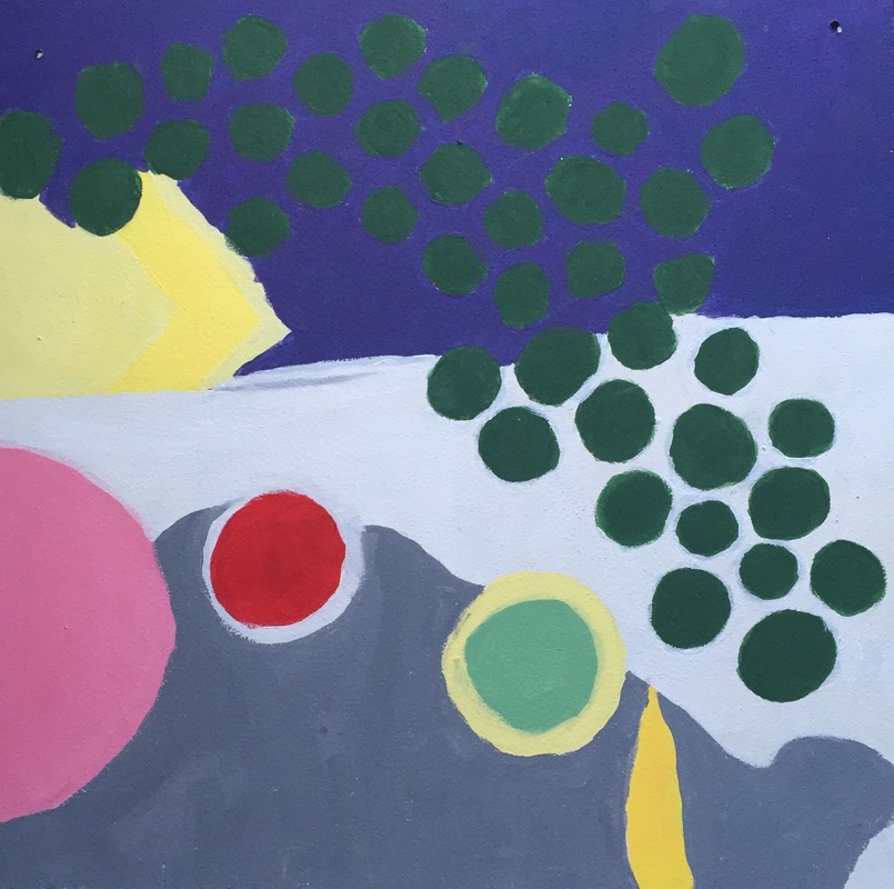
 This painting is in the style of Stuart Davis. For Davis' style I had to use blocks of solid color with use of primary colors and their tints and shades. This project was not difficult for me because of the painters style that I got.
0 Comments
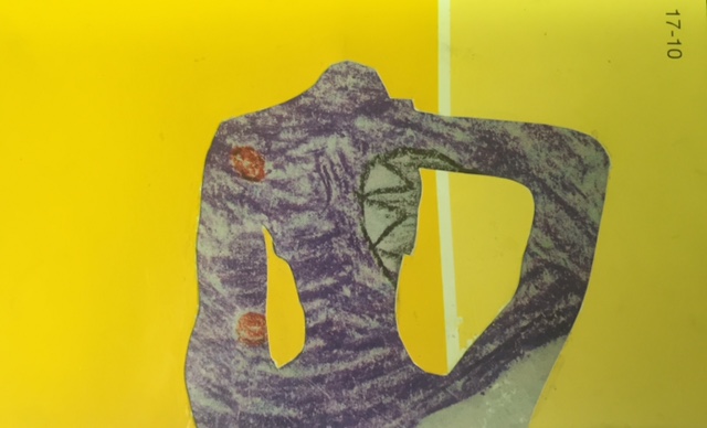
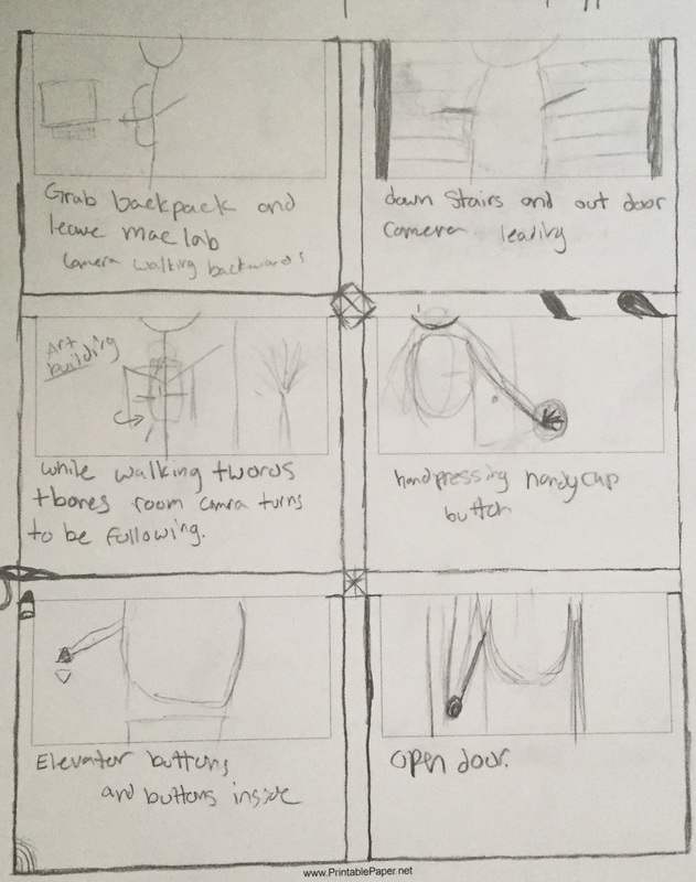
For this project we got the neck to waist aria which was probably one of the easiest to do because people are always using their hands and arms. We were supposed to choose a path that we might actually use or that has meaning to us so I chose the path I take to get from the art studio to my best friends dorm room. I originally planed to take the elevator but it took too long waiting for it to show up every time and it wasn't a consistent time so I decided to go with the stairs.
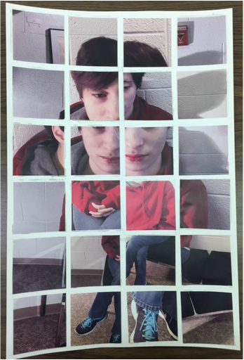
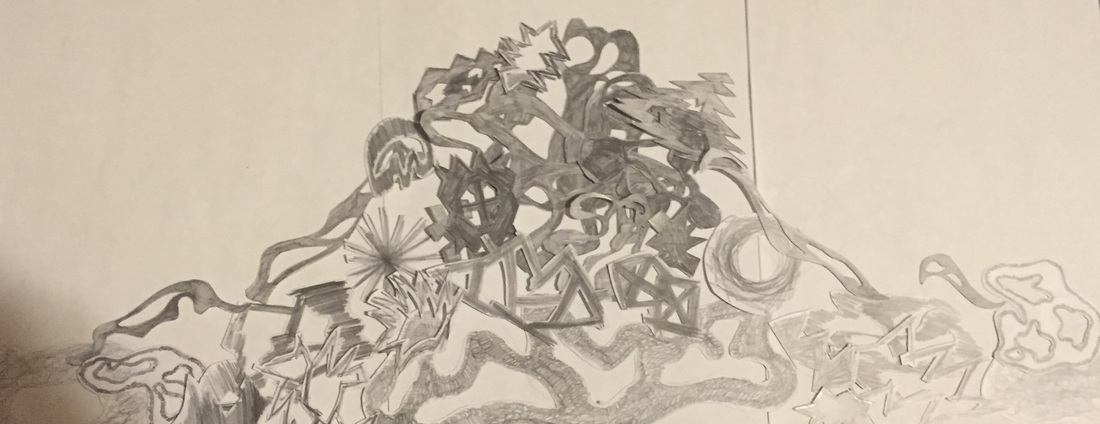
This is the happening I wrote which was chosen; Run in circles. Continue until dizzy. Walk away like nothing happened. 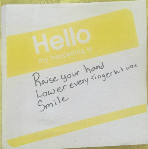 I really enjoyed this project, i thought the new vision angel of filming was a nice touch. I struggled with the assembly of this flip book, I accidentally glued everything in sideways. luckily i noticed quick enough to fix it but my craftsmanship suffered for it.
    This project was a lot of fun albeit a bit difficult. The first ones were easier but as we went on I started to run out of paint chips so i had to piece them together to fill the space and that was difficult.
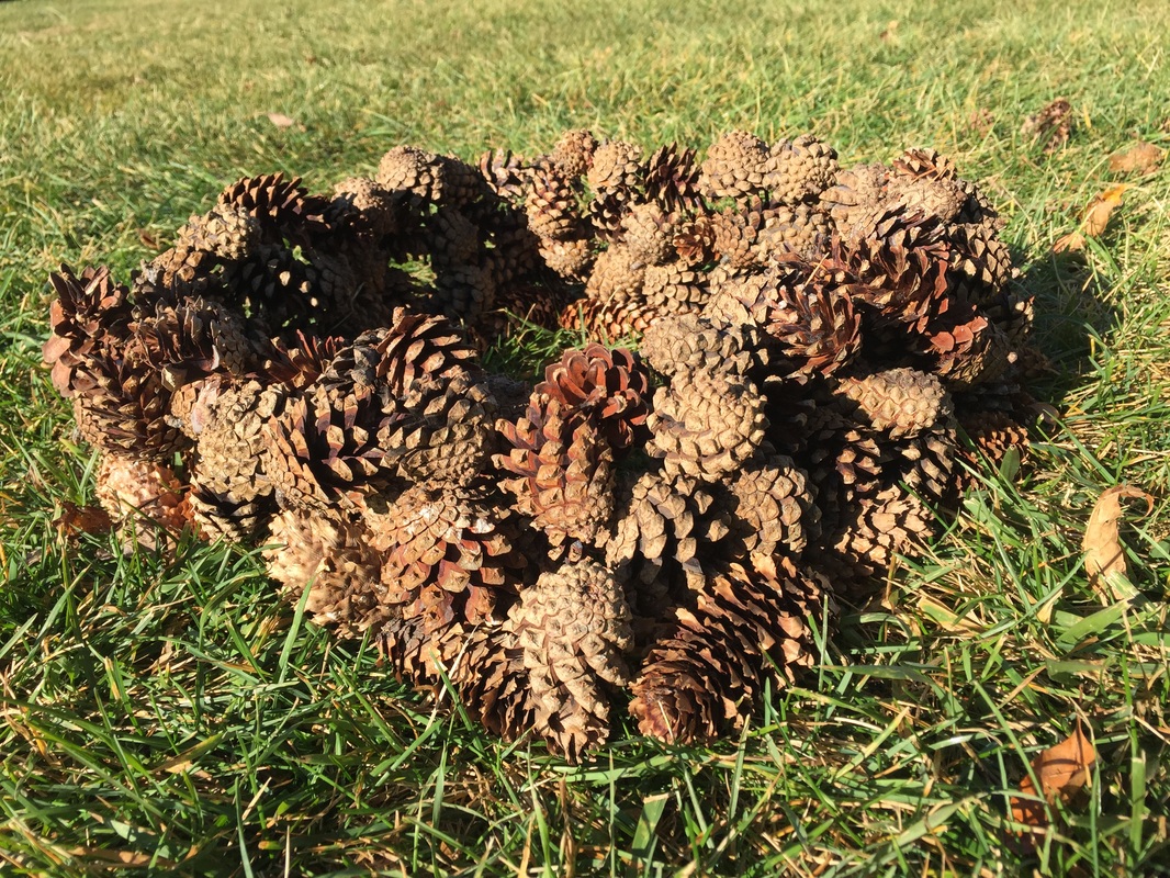
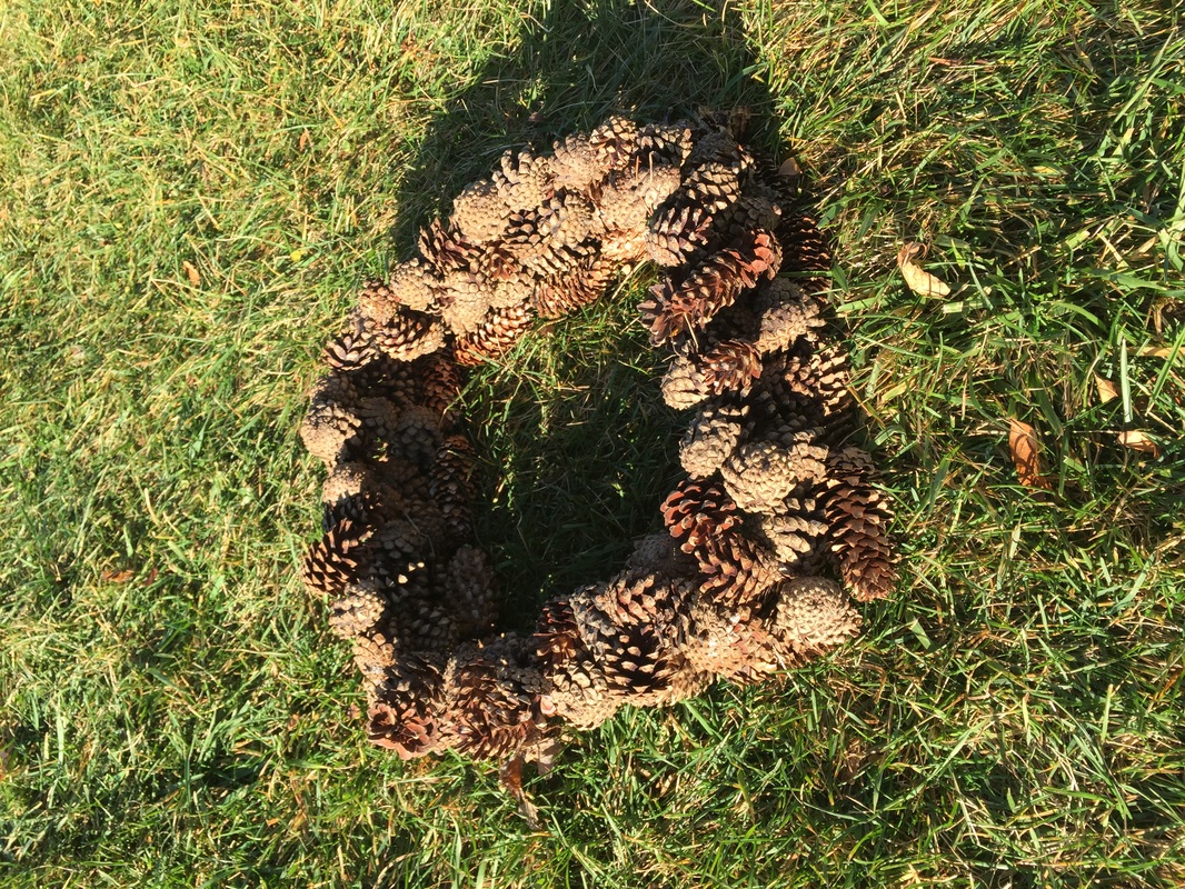
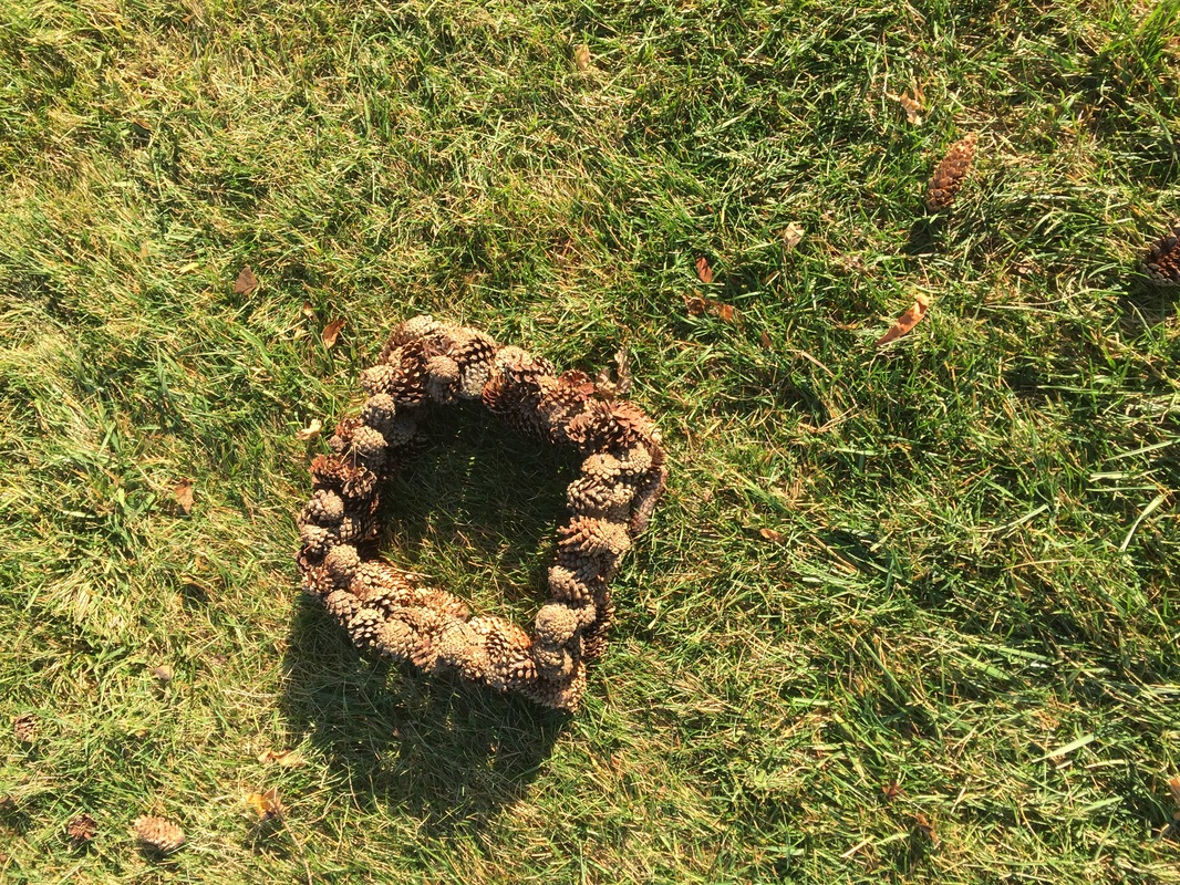
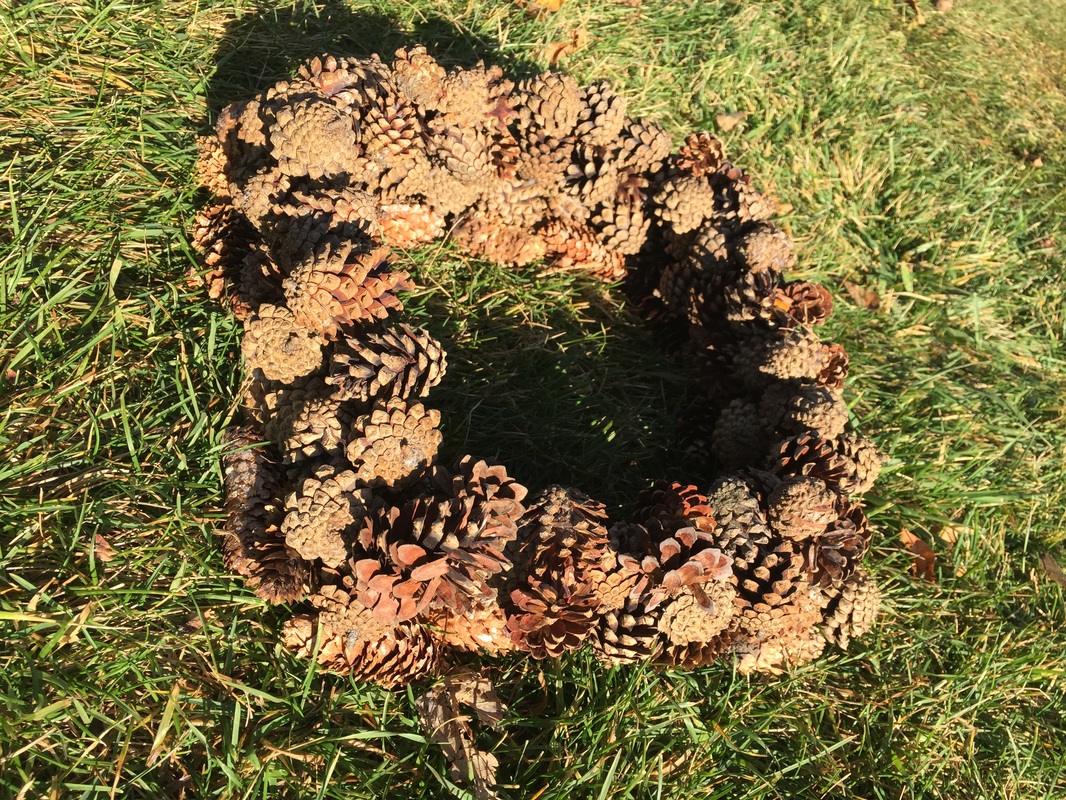
For this we decided to make a square out of pinecones because it was similar to what Andy Goldsworthy's work is like but we made it our own. It was dificult to get the pinecones to stay together at first but we eventually discovered that you can hock them tofether and they are easier to stack. While building there was a couple minor accidents where sections of walls were knocked down but we made it work in the end.
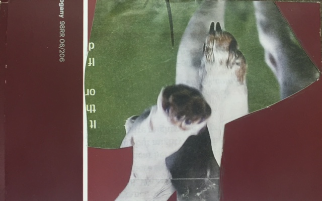
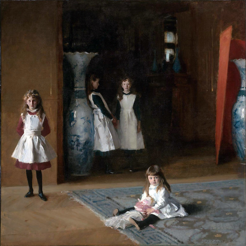
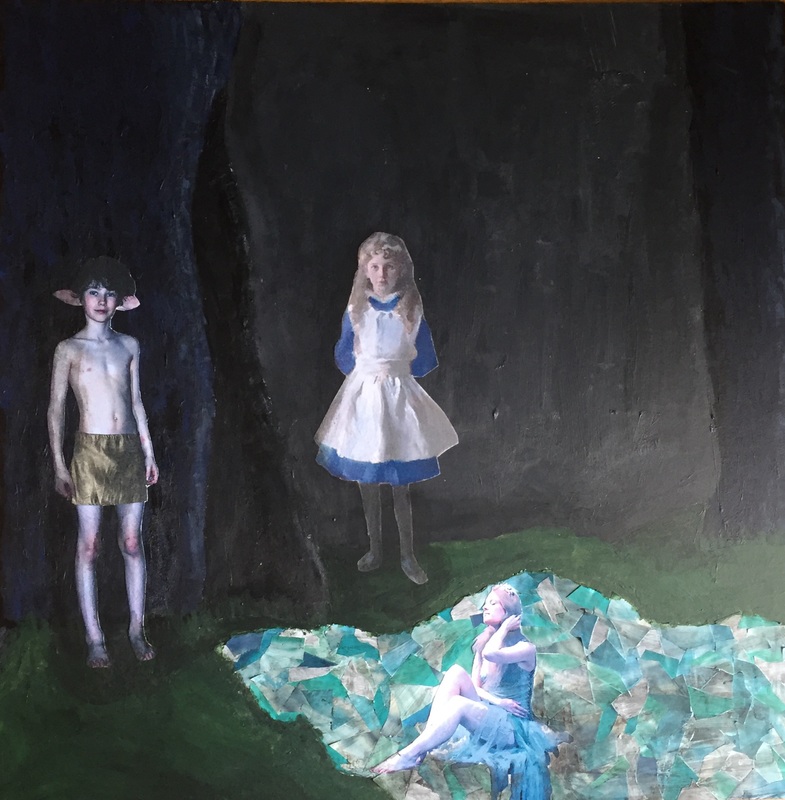 The theme that I chose was fantasy because I absolutely love fantasy novels and movies. It wasn't hard for me to think of a memory to go along with this theme as I have read a lot of fantasy books in my life. For my memory I decided to choose the time I locked myself in the room for a week to read the Percy Jackson series. This lead me to decide to turn the people in the original picture to mythological creatures that could be found in the books. These two creatures are a water nymph and a satyr.
My adjective was grim because the original picture was already pretty creepy so it inspired me to make it even more dark and creepy to be grim. Also I thought that the adjective grim could fit very well with fantasy because some fantasy books are very dark and creepy to the point that I would consider them grim. The first strategy that I chose to use was college. I decided to make the pond that the nymph is in a college of pictures of water. After I was done with it I decided it was too bright to be considered grim so I watered down some black paint and painted over top of it to help it fit in and I'm really happy with how it turned out. The next strategy I chose to use was color scheme and that was very easy to pick. I chose cool colors keeping everything close to my theme and adjective. To me cool colors go very well with the adjective grim because a cold person with a dark outlook on life is considered to be a very grim person. My third strategy was expressive line, this one is hard to see in the final picture but if you look closely you can see the lines in the trees and a little bit in the grass which I used to help add texture and depth as well as express my adjective grim. The lines are all very short which to me resembles a life being cut short by a tragic event or something of the sort which is very grim. I decided to keep the little girl who I thought was creepiest which happened to be the one standing off to the left but since I already had planned a new character to go there she had to be moved. There was another problem with this little girl though, she was wearing a red dress which didn't fit with my color scheme. So I put her into photoshop on my laptop and used what knowledge i have to recolor her dress and scale her to the exact size I would need for my larger version of the painting. The elements I used were line, texture, and color while the principals I used were emphasis and movement. I used texture to give both the trees and grass more detail and I used line within this texture to express my adjective. I used color to further express my theme. I used emphasis to draw your eye to the water nymph in the front of the picture because the eyes of the other two characters pull your gaze away from her so I tried to create a sort of balance, this also caused the movement in my picture as your eyes move between the three points. Final Project
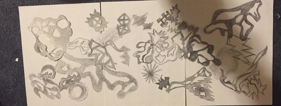
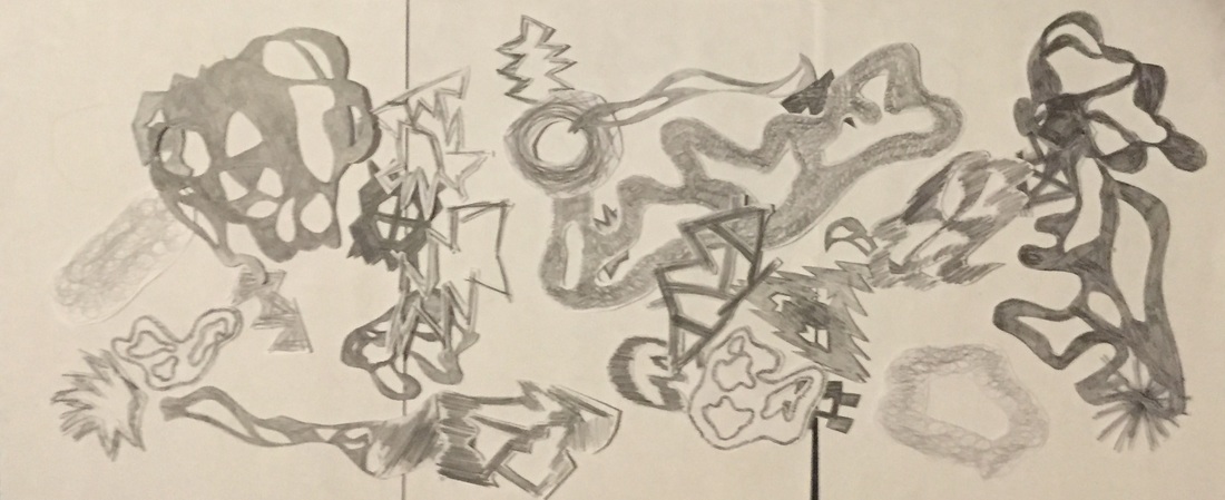
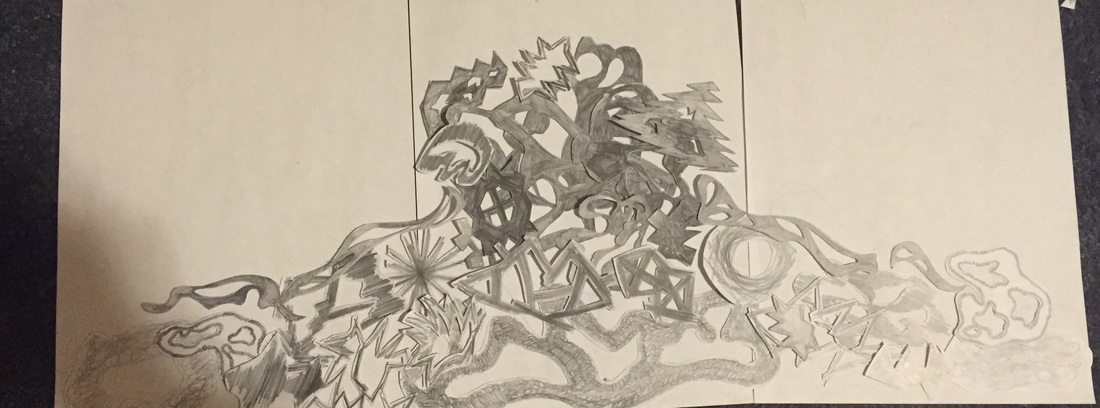
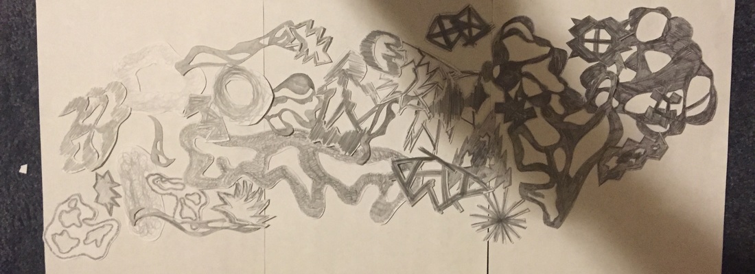
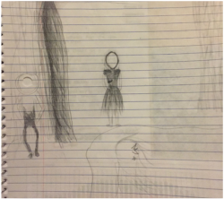
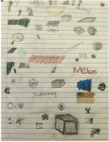
Planing and Sketches
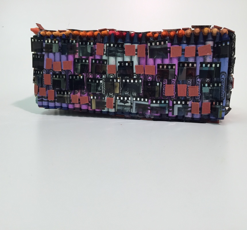
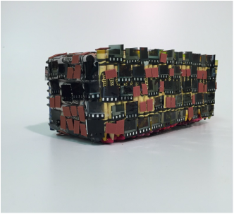
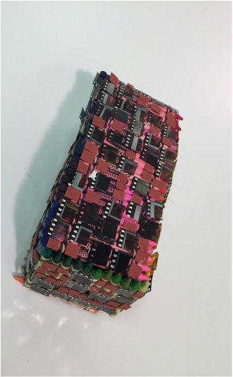
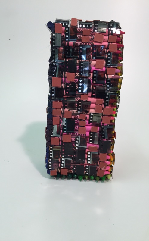
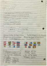
This project was really enjoyable for me because I really like music. With my theme being identity, my lyric was not hard to choose at all, it popped right into my head when I was told about this project. It was hard for me to choose a code though. I wanted to do a "made up" code but that was against the rules so I started looking up codes and testing them out. The next challenge I faced was coming up with a not typical support. Finally I thought about the mass amounts of crayons I own and how I could use those. I made my crayons into a rectangular prism to use as my support. Then I had to decide how to make my code. I found the film things and decided those would work and I started glueing. Overall I enjoyed this project and I'm happy with how my project turned out.
 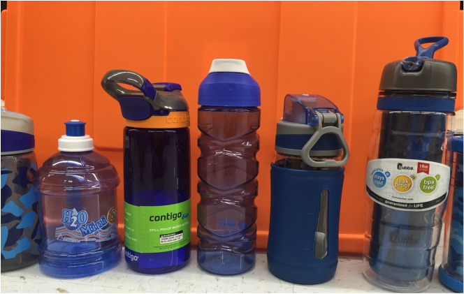 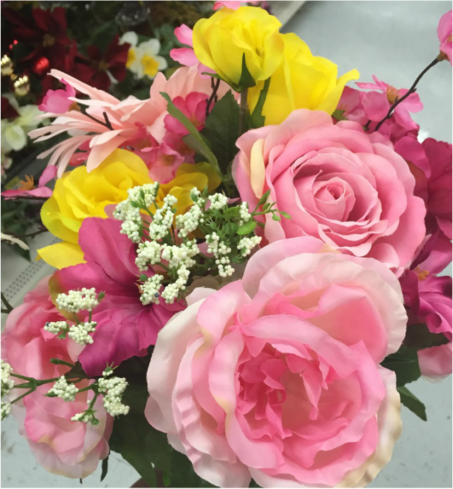 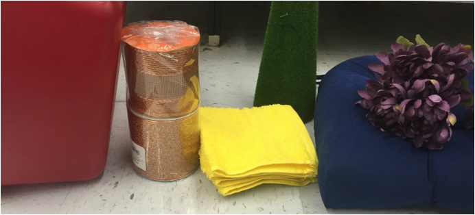 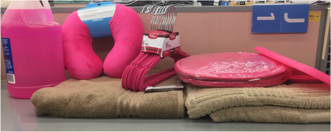 For this project I decided to go to Walmart because they have everything so colors should be easy to find. I'm not happy with how my pictures turned out but I couldn't go back and try some more because of the anxiety caused by this project. I decided to make a rainbow set up and a couple with colors I thought went nice together.
|
KaCee CostelloGraphic Design Archives
April 2016
Categories
All
|

 RSS Feed
